50 Shades of Gold No More
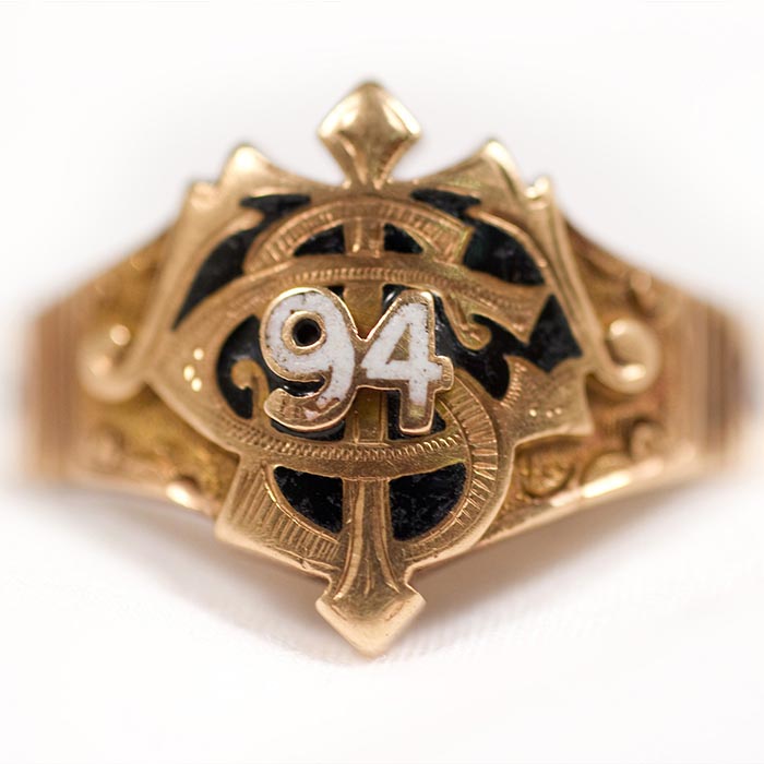
"The earliest known class ring from Tech - bears the seal of the Georgia School of Technology, the original name of Georgia Tech and features the three official colors - white, blue and gold." (from Tech's new brand site)
What is gold? Throughout history, men have lusted for gold, fought wars for it, launched expeditions to find it, and laid broken when their exploits proved fruitless. The quest for gold has been, no doubt, an arduous one.
But why do we hunger for it? Why do we care so much about an earthen metal? The concept of gold - its very nature - evokes a sense of history, tradition, and power.
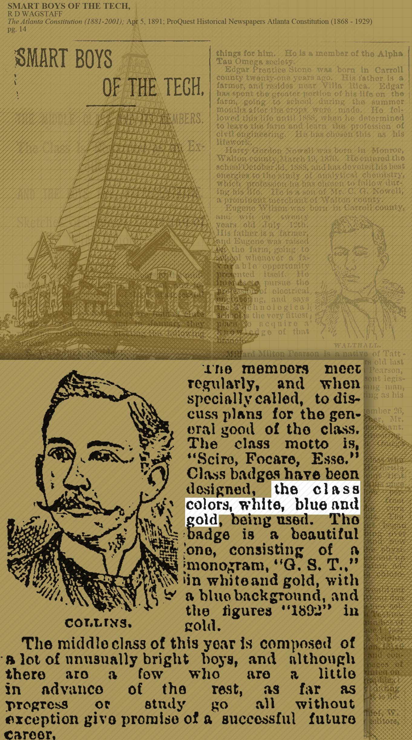
During the spring of 1891, a group of Georgia School of Technology students picked white, blue, and gold as our colors. Their class crest bore the letters G.S.T., emblazoned in white and gold atop a navy background. Gold has been always been king on this campus.
When head football coach and future athletic director Bobby Dodd gazed upon the Ramblin’ Reck mascot car in 1974, he saw an old mustard-yellow car desperately in need of a revamp. He stumbled upon a deep gold color in a Lincoln car paint catalog. The color was regal - it was powerful - it was ambitious. It symbolized the type of program he wanted Tech to become: the gold standard of academics and athletics. He asked for the car to be painted gold, and later, his teams’ helmets came to match.
When Georgia Tech later began redefining what shades of gold and yellow were deemed acceptable in its athletics branding and apparel hundreds of different ways1, we cried out in agony. In a single fell swoop, we had torn decades of tradition and history asunder. We now had yellow, mustard, and light brown all masquerading as the Institute’s gold. We needed unity again - we needed the power of gold.
"Within Athletics, the available options to display the interlocking GT have gone from 40 to just eight." (from Tech's new brand site)
Gold has always been an icon on this campus. No more Buzz gold, no more yellow, no more mustard, no more light brown – there should only be gold. And now, there is.
Now that we’ve gotten past my semi-coherent ramblings about gold, let’s talk about Georgia Tech’s branding as a whole. For years, Tech has had a notoriously bad branding problem. Nothing exemplifies that more than the GIF above - there used to be 40 different iterations of the interlocking GT logo with a variety of combinations of yellow, gold(-ish), black, and navy and seemingly hundreds more variations of gold used on apparel, split across various vendors. Additionally, Russell Athletic rarely got anything perfectly right. Over the last twenty years, our uniforms have been in constant flux, using various shades of gold that rarely match from helmet to uniform and sometimes making serious mistakes in production.
The Adidas contract does two huge things for Georgia Tech Athletics:
- It takes Tech out of the “Dark Ages” of Russell uniforms (and they were dark ages, believe me) and brings renewed excitement and energy around the program, which
- It offers up a unique opportunity to refresh all of the Institute’s athletics marks.
Branding is a small passion of mine, and I’ve always been interested in how sports franchises and organizations pull off a large-scale update of their brand and how their new marks compare to their old brand elements. When your (future) alma mater gets a brand revamp, it might as well be Christmas.
Here’s the new wordmark:

"The iconic Tech Tower letters, the tradition of Georgia Tech and the innovation of our institute inspired a sharp, bold mark that both celebrates our history and points us to the future." (from Tech's new brand site)
and the new primary version of the interlocking GT:

"With our new apparel partner and sideline provider, exciting things are on the horizon." (from Tech's new brand site)
If you want to see the full artsheet, head here.
There are two major changes to unpack here:
-
Most obviously, the new wordmark. It’s a bold and modern take on the Tech Tower font, and using on that Tech icon for inspiration evokes a sense of tradition and history behind the mark. The only iffy parts are the minor design inconsistencies: notably, the lack of a bottom serif on the E and the Russell Athletic-esque points on the G, R, and H (but curiously not on the A). Overall, my grade for the wordmark: B+ (curved to an A, in true Tech fashion).
-
A subtle change to the new shade of gold. This might be the more important of the two changes; like mentioned above, Tech has lacked a consistent shade of gold on its apparel and in its branding for far too long. This shade matches the paint job of the Ramblin’ Reck, which is possibly the best possible source for a Tech color you could ask for. Overall: A++++++
This brand revamp is a sign of good things to come on the Flats. When he started his term, AD Todd Stansbury made branding a point of emphasis for his administration, and early on, it looks like he’s delivering on that promise to the Yellow Jacket fanbase. With new uniforms and other apparel from Adidas in the pipeline, it is going to be an interesting next few months at the Institute, and I’m excited to see the other changes Athletics has in store for our brand moving forward.
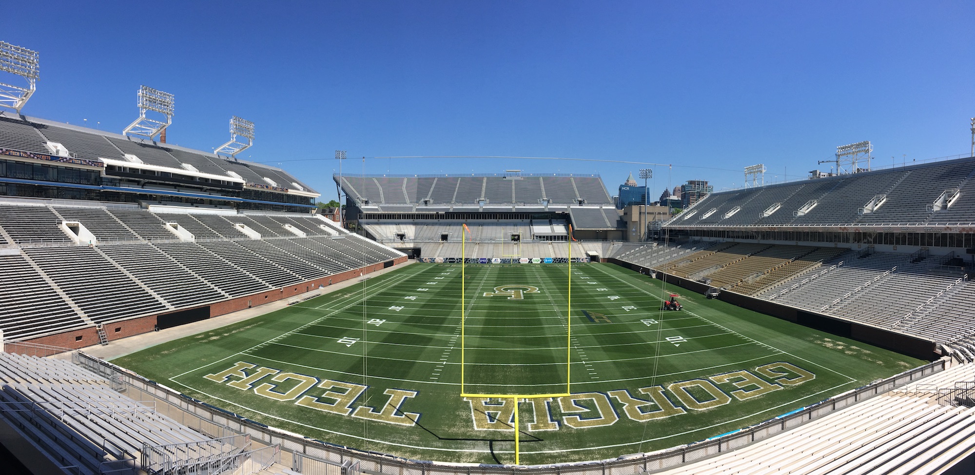
Georgia Tech's new football field design (h/t Jake Grant)
-
This is a mild exaggeration, but it has felt true for years. ↩