Exploring College Football Analytics
Fair warning: lots of words and no pictures below.
Skip to the actual data analysis.
Despite being a freshly-minted adult, this is a continuing-education hill I will die on:
Taking a training course can really open your eyes to modern techniques and how certain things work, but taking said course means virtually nothing if you can’t use your newly-acquired skills in a tangible way.
Picking up a new skill is tough, but what makes it harder is not being able to practice using it. I’ve always had trouble retaining skills that I never use (Spanish, cursive, soccer, etc.), so whenever I pick up something new nowadays, I try to marry it to something familiar to ease myself into it.
In a roundabout, semi-didatic way, that brings us to when I signed up for a one-week crash course on data science in Python through work. Data science is, of course, today’s new hotness, and as a new grad in the software industry that didn’t pick up much in the way of statistics or math knowledge as part of my education1 (but had dabbled a little with R in the past and now had a ton of free time after the end of other personal projects), I felt it best to learn a thing or two about the field.
But the real reason I signed up for the course and took copious amounts of notes during it is simple: I wanted to understand college football better.
Now, this seems a little simplistic, so let’s diverge2:
I’ve been an ardent reader of any and all material from Bill Connelly, a resident statistician, senior writer, and college football data nerd at ESPN (and formerly at SBNation). I’ve always admired the job he’s done explaining the statistics he uses (which he also developed) in his writing (especially in his book Study Hall), which usually follows these steps:
-
He defines the concept, whether that be mathematically (with a formula) or semantically (with words and other, more familiar concepts). He’s (usually) speaking to a college football crazed audience, but he makes things easy for even a neutral to understand.
-
He provides the data or results that back the concept, so readers can draw their own conclusions or come to his conclusions themselves.
-
He ties the concept back to the real world, providing a relevant example of how the data he’s presented can be applied.
These points seem very simple, and you’d think that a lot of other writers follow them – sadly, I’ve found a number of sources that just do the first two3: while neglecting the third. Being able to apply a conclusion to a relevant example in the problem space is critical to understanding the conclusion itself and what it represents4 (do you see where I’m going with this now?).
Back once more to the purpose of the data science course at hand5:
Connelly puts out advanced box scores every week, relying on play-by-play data from…somewhere (probably ESPN, now) to put together a variety of efficiency, drive progression, turnover, and explosiveness statistics that, when applied in unison, tell the story of a college football game more holistically than the usual box score from ESPN. A number of the metrics he includes are very straightforward and intuitive to pick up and use, and others are even cribbed directly from the original box score (since they were incredibly useful already).
But there are two (well, really three…maybe four) things that Connelly provides that are really his secret sauce (and as such, incredibly proprietary):
- SP+6 (neé S&P+7) and the post-game win expectancies that he generates via it
- IsoPPP and the expected point values for each yard line on the field.
When it comes to things I’m interested in (like college football), I don’t like taking what I read for granted: it wasn’t enough for me to read Connelly’s numbers – I really wanted to understand them, and to do that, I had to derive them myself (or, at least, cobble together approximations that I’m happy with the accuracy of).
Thus, with the skills I picked up from that data science course, I’ve spent a lot of long nights been casually tinkering with college football data (via the creatively-named College Football Data site and API) in my spare time lately to put together my own advanced box scores that have guided my post-game breakdowns for From the Rumble Seat. This exercise has been immensely rewarding and enlightening: I’ve gotten to learn a new skill, but also I’ve become a more educated fan and “student of the game” (as pretentious as that may sound) in the process.
I haven’t come close to replicating Connelly’s numbers8, but that’s not really the goal anymore9 – I want to use data to help others see “the game inside the game”. College football is an inherently human and physical endeavor, but quantifying and analyzing each and every play helps us question and verify football conventions (“establishing the running game”, “punting is always good”, “don’t risk fourth down attempt in no-man’s-land”) and discover new ways to optimize and evaluate performance in the sport.
Enough of the high-level philosophical talk – let’s get to the data. The following are a few of the explorations/experiments/problems/whatever I’ve looked at over the past few months. I’m providing Connelly’s “three principles” where appropriate because:
- He’s one of the few media personalities that explains their stats methodologies in any capacity10, so I want to do the same.
- It would be cool for this to be a collaborative venture to build a more educated college football fandom11 (not that I have any clout to do that, per se).
- This stuff can get really interesting and I like writing about it, even when it’s not Tech-related.
Without further ado, the list so far:
Halftime Adjustments
From a comment left on From the Rumble Seat:
I’d like to see a comparison of how the defense did between the first and second halves of each game. COFH was an extreme case, but our lack of depth and ability to play at a high level for a solid 60 minutes was apparent even in the NC State game. It’s not a new problem of ours, either (see the Tennessee game). Not sure if it’s a S&C issue or an issue with not having a good bench, or both.
If you look at non-garbage-time situations and break down the plays Tech faced defensively this season:
First Half:
- Rush Success Rate Allowed: 47% (national avg for full game: 41%)
- Pass Success Rate Allowed: 41% (national avg for full game: 41%)
Second Half:
- Rush Success Rate Allowed: 39%
- Pass Success Rate Allowed: 43%
It seems like the defense is tightening up on rushing situations and giving up more ground on passing situations in the second half when compared to the first. If we consider the play distribution at play in each half (again, non-garbage-time only)…
First Half:
- Rush: 56%
- Pass: 44%
- Other (usually ST plays): 0%
Second Half:
- Rush: 63%
- Pass: 36%
- Other: 1%
…we can add some context to those numbers.
[Firstly, w]ith respect to [the] original point, Tech defends the rush 6% better and the pass 2% worse in the second half. Given that pass plays are usually much more explosive and we’re looking at numbers that have had garbage time removed, I’m tempted to say these margins aren’t particularly significant in terms of improvement (or lack thereof, in our case) between halves.
BUT: if you consider these improvements significant, it’s clear that halftime adjustments matter (“duh,” you might also say — but bear with me). If you’re looking at the success rates, the Tech defense settles in the second half and keeps the Jackets in games. On the flip side, opponents adjust their play calling to maximize what they can do versus what has been a porous Tech run defense in the second half. If I had to guess further, opponents’ passing success rate is lower in the second half than in the first because if you’re running the ball and playing conservatively, you’re only going to pass in riskier situations. Therefore, it follows that you’d succeed less often from those situations.
EqPPP and IsoPPP
Background
There’s a lot of literature on Expected Points Added (or EPA; examples here, here, here, and here), and calculating EPA can get very complicated depending on what factors you want to consider. However, one core idea remains: not all gains are equal. Gaining five yards from your own 30-yard line is much different and less important than gaining five yards on your opponent’s 30-yard line. spfleming at Frogs o’ War expands on the importance of this concept further (emphasis theirs):
[A]ll yards are not created equal. Using EPA allows us to compare performance across context, punishing teams more for making mistakes in high leverage areas and rewarding them more for excelling in those high leverage areas.
Deriving EqPPP
Considering that EPA requires weighting a lot of different factors, I just wanted to re-derive IsoPPP and Equivalent Points per Play (EqPPP). Based on the way Connelly describes EqPPP, calculating it should be pretty simple:
Throw out plays that don’t actually matter – most of these are non-FG special teams plays. Then, at each yard line:
- Bin together the plays that start there.
- Calculate the probability of a scoring play (offensive touchdown, defensive touchdown, safety, or field goal).
- Calculate the expected value of a scoring play based on those scoring probabilities.
Thus, you get the amount of points (usually a decimal) that you expect from a play that starts at a specific yard line, and if you subtract the EqPPP value for a yard line a play ends at from the value for the yard line it starts at, you get the EqPPP value added for that play. This number is fundamentally different from EPA – it’s independent of down, distance, or quarter, and is simply a measure of efficiency in zones of various leverage levels on the field.
Deriving IsoPPP
But the problem with a sum or average of EqPPP values is that it confounds explosiveness and efficiency. Yes, it shows you how an offense is performing on aggregate, but chunk plays are going to have higher EqPPP values by nature. We already have a pure efficiency metric in success rate, so how do we get a pure explosiveness metric from EqPPP to pair with it?
In comes Connelly’s IsoPPP (Isolated Points per Play) – what if we simply considered EqPPP on successful plays? We know how efficient a team can be, so “when (a team is) successful, how successful are (they)?”. Connelly (at least circa early 2014) calculates IsoPPP12 by:
- Splitting out successful plays from the total set. Successful plays are defined as those that earn13:
- 50% of the yards to go on first down
- 70% of the yards to go on second down
- 100% of the yards to go on third and fourth downs
- Find the average EqPPP across those successful plays.
Now, we have a number that is strictly focused on explosiveness, and we can back up claims about a team’s effectiveness in leverage situations with data.
Application (AKA: Why does this matter?)
Again, IsoPPP answers the question, “when you were successful, how successful were you?”. When we talk about IsoPPP, we’re talking about the advantage a team has created when it’s operating at peak efficiency. It also helps provide in-game context to success rate; for example, take these two teams:
- Team A: below-average success rate, high IsoPPP
- Team B: above-average success rate, low IsoPPP
Which team is doing better? Arguably: neither.
Team A might only be successful in spurts, but it’s maximizing what they do in those spurts – you might see this in flex-bone offenses (think service academies or pre-2019 Georgia Tech); each run play may only go for three yards (usually not hitting the 50% or 70% of yards-to-go mark for success), but each pass play (pass plays are usually more likely to be explosive) is usually a deep ball.
On the other hand, Team B is working its way down the field methodically in small chunks. Teams like Iowa and Stanford grind down opposing defenses this way: they don’t try to stretch the field in limited opportunities, they aim for four to five yards per carry on the ground and short to medium gains through the air.
Adapted Advanced Box Scores
Like I mentioned before, Connelly tweets out advanced box scores after every week’s worth of games for a subset of games he finds interesting14. After working with stats for a while and putting them into his format every week for From the Rumble Seat, I felt comfortable enough to start iterating off it.
Major changes
-
I removed the IsoPPP comparison in favor of adding success rate by down, mostly because I hadn’t generated IsoPPP values I was happy with when I started tinkering. Success rate by down doesn’t fulfill the same purpose as IsoPPP, but I figured if you’re going to give the people a breakdown of success rate by quarter, you might as well also give them one by down.
-
I removed the player-level stat boxes, aggregating into simpler tables – I had automated retrieving passing and rushing stats from the play-by-play, but it was getting tedious to manually copy and paste the defensive stats from ESPN.com into the spreadsheet. You lose a level of detail, but since I usually want the 30,000-foot view of the game and understand general game flow, this is fine.
-
I added pace stats like time of possession, time per play, time per drive, and time between scoring opportunities. Pacy offenses are going to put up more yards (and probably score more points) because they run more plays in the same amount of time as an average offense, so I figured it would be nice to see that broken down clearly.
-
I added success rate on scoring opportunities to the basics table. Connelly notes that it plays a role in the “finishing drives” portion of the “Five Factors”, so I’m somewhat confused that as to why it wasn’t there before.
-
I added special teams efficiency metrics, based on the definitions of Kickoff and Kick Return Success Rate from Connelly’s previous work. He has a more complicated calculation for punt success rate involving a polynomial regression, so I’ve left that one alone for now. I did add one stat of my own: Touchback Zone Rate (Tbk Zone %), which is the number of kickoffs that went past the opponent’s 25-yard line and were not returned. Normal touchback rates may only include kickoffs that bounce out of the back of the endzone or are kneeled by a returner in the endone. By extending our scope to the 25, we can include the kickoffs that were fair caught, as per a recent NCAA rule change. This gives you a much better idea of what teams consider “returnable kicks” and how often they are willing to give up the free yardage of a touchback for potentially better field position.
-
I added havoc rate and stop rate columns to the defensive stats. Havoc rate is calculated by aggregating tackles-for-loss, passes-broken-up, and forced fumbles (the base categories of “havoc plays”), then dividing that sum by the total number of defensive plays. Stop rate is a little trickier – I’ll let my past self explain:
[S]top rate, a defensive effectiveness metric pioneered by The Athletic’s Max Olson, measures the proportion of defensive drives that ended in punts, turnovers, or turnovers-on-downs. Essentially, this number puts data behind the colloquial football belief that teams who get more stops win more games — thus, a higher stop rate is better.
Minor changes
-
I added stats around third- and fourth-down conversions and conversion rates. This might be a bit of traditional football convention holding me back, but I believe understanding how well teams did in these “leverage” situations and the clip at which they extended drives helps create more informed offensive analysis.
-
I added sack yards and explosiveness rates to the passing stats. Having sack yards built-in to the spreadsheet made calculating a sack-adjusted yards/attempt number much easier, and I’ve found it useful to see how dangerous teams were throwing the ball down the field.
-
I added carries and yardage totals, as well as explosiveness rates, to the rushing stats for more or less the same reasons as the above changes to passing stats – easier calculations and use of explosiveness as a metric.
Together, these changes allowed me to put together a really nice spreadsheet for my off-season stat breakdowns for the Georgia Tech offense and defense.
I definitely want to iterate on these a bit further. There seem to be a couple of obvious next steps:
- Add special teams efficiencies to the box score. That “third” of the game isn’t covered at all by our current set of metrics, and the derivation of those stats isn’t super complex either.
- Generate and display post-game win-expectancies like Connelly does, which brings us to my next venture.
Post-Game Win Expectancy
Five Factors Ratings → Probabilities
A formula for post-game win expectancy is truly my white whale. Conceptually, it’s incredibly valuable to be able to say “given your performance, here’s the chance that you would have won this game”. Despite having limited statistical and machine learning knowledge, I’ve tried to cobble together concepts from Connelly’s back-catalog to synthesize “Five Factors” ratings for both teams in a given game. Given a dataset of play-by-play, drive, and game data from 2012-2019, I calculate the difference between the ratings for each game and then use the set of those differences as the input to a linear regression model. The output that this model is trained on is the final score of each game – more specifically, the difference between the teams’ scores. The model is based around Connelly’s “Five Factors”, and each factor is numerically evaluated like so (subject to change, check here for the latest weights and formulas). Each factor is an in-game margin, so for every metric, subtract one team’s value from the other’s to get the margin.
Updated: 25-Dec-2019
-
Efficiency - Weight: 35%
- Offensive Success Rate Margin (100%): this one’s easy enough; to get success rate, find the number of total successful offensive plays and divide by the total number of offensive plays.
-
Explosiveness - Weight: 30%
- Average EqPPP Margin (100%): see Deriving EqPPP for the derivation. This is just the in-game average EqPPP for each team.
-
Finishing Drives - Weight: 15%
- Points Per Scoring Opportunity Margin (45%): this is the average number of points a team is scoring on a scoring opportunity (IE: a drive that goes inside the opponent’s 40-yard line). For simplicity’s sake, I assume that each touchdown is automatically worth seven points. Take the total number of points that a team has scored in a game, and divide it by the number of scoring opportunities it has generated in that game.
- Scoring Opportunity Rate Margin (30%): this is how often a team generates scoring opportunities, so take the number of scoring opportunities a team creates and divide it by their total number of drives in a game.
- Scoring Opportunity Success Rate Margin (25%): this is just success rate on scoring opportunities, so use the same formula but limit the plays under consideration to just those on scoring opportunities.
-
Field Position - Weight: 10%
- Average Starting Field Position Margin (100%): this one’s pretty straightforward – average together the yard lines at which each team’s offense starts their drives.
-
Turnovers - Weight: 10%
- Turnover Luck Margin (30%): this is where things get a little complicated. Let’s establish some key facts:
- Turnover luck is this difference between expected turnovers and actual turnovers.
- The number of expected turnovers is calculated using expected fumbles and expected interceptions.
- The number of expected fumbles in a game for both teams is generated by halving the total number of fumbles lost between both teams.
- The number of expected interceptions in a game for each team is generated by multiplying the sum of the number of passes broken up (PBUs) suffered by each team’s offense (AKA: the number of PBUs generated by the opposing defense) and the number of actual interceptions by 0.22.
- Here’s how it all shakes out formulaically:
$$ \mathsf{ExpTeamFum = 0.5 * TotalFum} $$ $$ \mathsf{TeamTotalPDs = (TeamOffensivePBUs + TeamOffensiveINTs)} $$ $$ \mathsf{ExpTeamINT = 0.22 * TeamTotalPDs} $$ $$ \mathsf{ExpTO = ExpTeamFum + ExpTeamINT} $$ $$ \mathsf{TOLuck = ExpTO - ActualTO} $$
- Sack Rate Margin (30%): this one’s pretty simple – take the number of sacks by a defense and divide it by the number of plays they faced.
-
Havoc Rate Margin (40%): we’ve discussed havoc rate before:
Havoc rate is calculated by aggregating tackles-for-loss, passes-broken-up, and forced fumbles (the base categories of “havoc plays”), then dividing that sum by the total number of defensive plays.
- Turnover Luck Margin (30%): this is where things get a little complicated. Let’s establish some key facts:
Once you have all five values, we can use them to generate a weighted mean with the given weights. We then get the margin for this mean (which is called the “Five Factors Rating”, or 5FR), using this margin as the input variable for our linear regression. The points margin (or point-spread) for the game is our output variable.
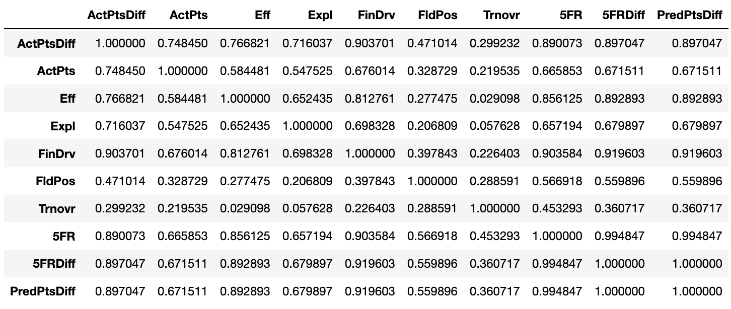
Putting together a correlation matrix reveals the effect of each factor on the regression15:
Results circa 25-Dec-2019
Notes & Limitations
Current Best Performance: R2 of 0.85 and R of 0.92
It might be important to note some pretty obvious things wrong with what I’ve built:
- The model technically generates a point-spread, not a win probability. I calculate the z-score of this point-spread and use that to generate the probability of that outcome, assuming a historically normal distribution of point-spreads.
- The model does not account for offenses beginning to evolve towards more spread-based attacks circa 2014-15, nor does it apply tweaks between years. Every game in every year is treated the same. Applying lower weight to games in earlier years would be a nice adjustment.
- This dataset is being analyzed by a statistical novice that used a very simple univariate linear regression. There’s probably a number of tools in the stats toolbox I’m pretty much oblivious to.
- The dataset used to test the model is a random sample of 20% of the whole thing. Depending on what games are in this bunch, the results could get screwy.
- The model doesn’t factor in special teams play, which is especially critical when generating field position metrics.
- There’s a key difference between the work Connelly is doing and what I’ve tinkered with: I have no desire to be predictive (although that could be fun) – I just wanted to reverse-engineer his post-game win expectancy stat to know how bad a team screwed up (or dominated!) in a game.
- This model and its results have no cool, possibly trademark-infringing name.
- The model still doesn’t account for 15% of its test dataset. I don’t know enough about statistics to say if this is an acceptable margin of error.
- The model is off by about a touchdown (+/-) on average. I know enough about football to say that this is not an acceptable margin of error.
- Edit (25-Dec-2019): Based on the correlation matrix above, it’s clear the calculations for the turnovers (R against actual point margin: 0.299) and field position factors (R against actual point margin: 0.471) are the weakest links in this model.
TL;DR: This work lacks a lot of statistical nuance that would take many moons of statistical education to learn, but I’m going to keep tinkering to see how close to an R2 of 0.90 or higher I can get to while maintaining that 90+% correlation.
Matchup Predictions
A fun sidebar to generating these post-game win expectancies is that I’ve been able to find the difference between two teams’ average 5FR in their last four available games and generate a prediction for that matchup in a given season. This isn’t particularly complex and could certainly be improved, but for now, it’s fun to play around with and compare pre-game projections to post-game outcomes.
Edit (25-Dec-2019): I’ve made quite a few changes to how predictions are generated:
- FCS teams get the 5FR of the bottom 2% of FBS. Yes, this does not respect quality FCS teams like North Dakota State and James Madison, but by and large, the average FCS team is much worse than the average FBS team, so this seems like a reasonable way to represent that numerically.
- The four-game window is now adjustable – specifying a week and year will predict the matchup given 5FR data that would have been available at the time. For example, a prediction for a game in Week 3 of 2019 will use 5FR values from Weeks 1 and 2 to generate a mean 5FR for each team, which will then thrown into the model for a prediction after a few more steps.
- The teams’ 5FR values are adjusted by an overall strength of schedule (SoS) factor, which is generated by:
- Finding all of each team’s opponents up to the week in question
- Calculating the average 5FR of the specified opponents
- If team 2’s 5FR faced is higher, then team 1’s 5FR is multiplied by team 1’s opponent mean 5FR divided by team 2’s opponent mean 5FR, and vice versa if team 1’s 5FR faced is higher.
- The teams’ 5FR values are then adjusted based on the “sub-division” of each team – Power 5 or Group of 5. This follows the same process as adjusting for strength of schedule, except instead of only considering each team’s opponents for the 5FR mean, the mean considers all of the teams in the same “sub-division” as the team in question.
- The 5FR values are adjusted one final time, this time considering the conference affiliations of the two teams. Same process as before – now just considering the teams in each team’s conference.
Examples
The changes to the prediction algorithm16 allow us to compare pre-game projections to post-game data, which reveals some very interesting things, such as the gulf between Georgia Tech’s 2019 projections and its performance:
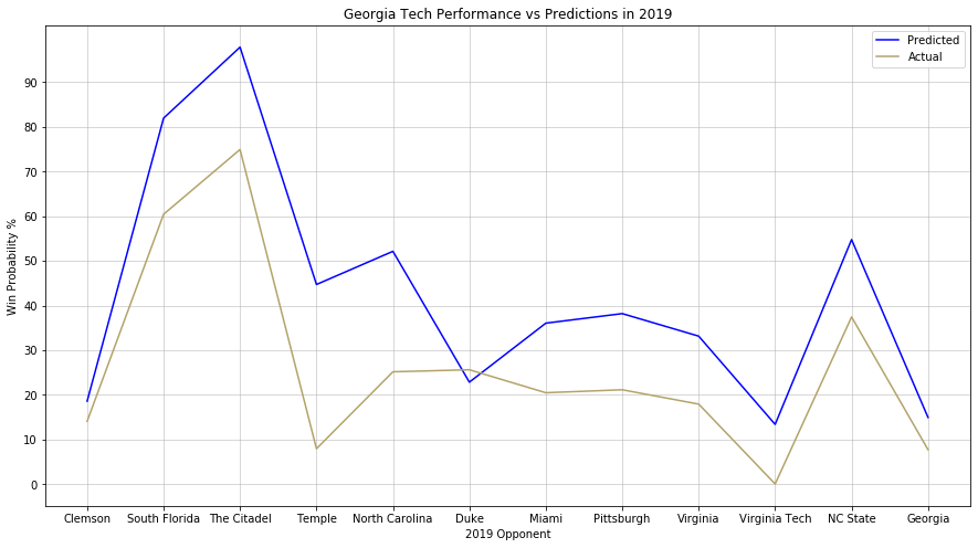
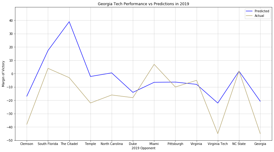
Neither paints a particularly rosy picture of the season that could have been or was.
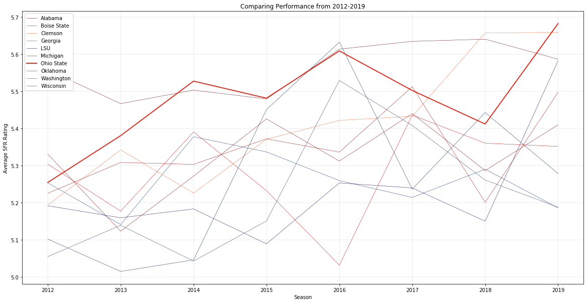
Edit (17-Jan-2020): I’ve done some work to build out some more visualizations and a test harness to run back seasons of games to check predictive performance. Here’s an example of the former – charting the annual performance of the top 10 teams in average 5FR from 2012 to 2019, with Ohio State highlighted.
Evaluating betting performance was complicated algorithmically, but the results turned out very promising for potential “investments” next season.
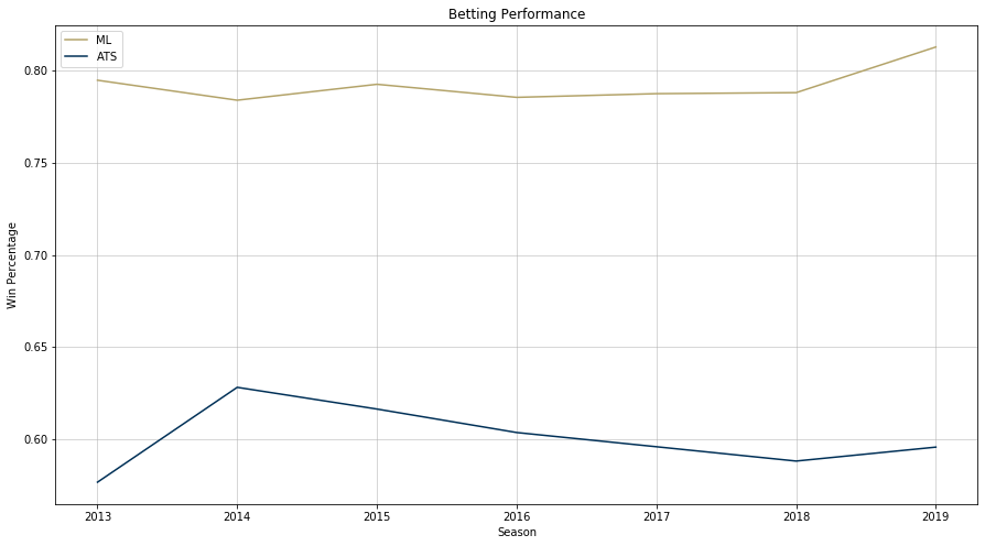
Like before, more iteration on this model should yield more accurate predictions and post-game projections. However, in the meantime, one could bet with some success using this data…if you were into that sort of thing, of course17.
-
Well, I did – I just never bothered to remember any of it because I never used it again. ↩
-
They do even just that poorly, simply providing the data and a relevant formula and expecting you to figure things out. This horse wants to be led to water! ↩
-
This is something I strive to do in my own (albeit much more limited) statistical writing – I want readers to understand the stat I’m presenting both as a number and as what it looks like on a football field. ↩
-
As a cousin to baseball’s OPS and OPS+, S&P+ consisted of a sum of a team’s success rate and Equivalent Points per Play (weighted at 86% and 14% respectively) that had been adjusted based on the national average. As time went on, the calculations got more complex and relied more heavily opponent-adjusted metrics as part of the “Five Factors” of Football. ↩
-
Rumor has it that lawyers from the S&P 500 forced him to drop the ampersand when he moved to ESPN. #RIPAmpersand ↩
-
Nor might I ever, considering the statistical methods that may be involved, the differences in his data source and mine, difference in weighting various factors, etc. ↩
-
Well, at least not the primary goal. I’ve made a lot of progress towards that, but just need to tinker more (and maybe learn some more math) to get it just right. ↩
-
Despite his descriptions being sometimes unclear… ↩
-
But I do dabble in the dark art of college basketball too. ↩
-
Said method wasn’t clear to me on the first read: is it the average EqPPP per successful play, or is it the total EqPPP for the game divided by the number of successful plays? Am I bad at reading comprehension? Who knows? ↩
-
You can also sum these successful plays and divide by the total number of plays to get the aforementioned success rate. ↩
-
He used to provide them for all games, but that hasn’t continued after he moved over to ESPN. ↩
-
I’m probably explaining this incorrectly, but oh well… ↩
-
Is it really an algorithm? I feel like that word implies complexity that none of my work really has… ↩
-
During the 2019 bowl season, the model went 24-16 picking games straight up and 19-21 against the spread. Disappointing considering the average performance of the model in past seasons, but bowl season typically has some quirky results. On to 2020! ↩